The formula
slope = (maxSize − minSize) ÷ (maxWidth − minWidth)
intercept = minSize − slope × minWidth
font-size: clamp(minSize, intercept + slope × 100vw, maxSize);
Example
Text that grows from 18px on a 375px phone to 32px on a 1280px desktop: the slope is 14 ÷ 905 ≈ 0.01547, so the
preferred value is about 0.7624rem + 1.547vw, giving
clamp(1.125rem, 0.7624rem + 1.547vw, 2rem).
Good uses for fluid sizes
- Headings that are large on desktop but don't overflow on phones.
- Section padding and gaps that grow with the screen.
- A whole type scale: calculate one clamp() per heading level.
Frequently asked questions
What does CSS clamp() do?
clamp(min, preferred, max) returns the preferred value, but never less than the minimum or more than the maximum. With a preferred value based on the viewport width (vw), sizes scale smoothly between two screen widths and stop at sensible limits.
Why use rem instead of px?
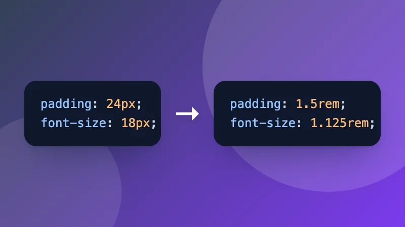
rem is relative to the root font size, so text still grows when someone increases their browser's default font size, which is important for accessibility. The calculator outputs rem by default and converts using the root size you set (usually 16px).
How is the formula calculated?
The size grows in a straight line between the two viewport widths. The slope is (max size − min size) ÷ (max width − min width). The preferred value is then intercept + slope × 100vw, where the intercept makes the line pass through the minimum point.
Is clamp() supported everywhere?
Yes. clamp() works in all current browsers, including Safari on iPhone. It can be used for font sizes, padding, margins, gaps and widths.