Color harmonies explained
| Palette | Hues | Feel |
|---|---|---|
| Complementary | Base + 180° | High contrast, energetic |
| Analogous | Base ± 30° | Harmonious, calm |
| Triadic | Base + 120° + 240° | Vibrant but balanced |
| Split complementary | Base + 150° + 210° | Contrast with less tension |
| Tetradic | Base + 90° + 180° + 270° | Rich; best with one dominant color |
| Monochromatic | One hue, different lightness | Clean, consistent |
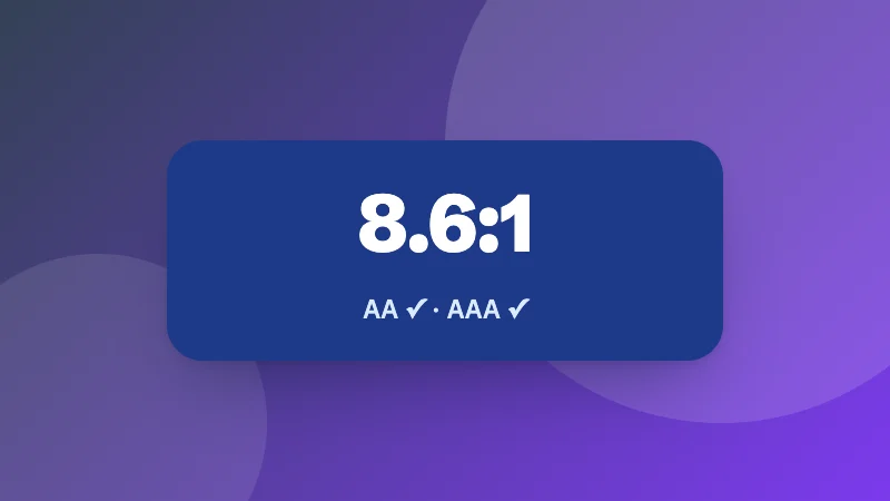
Use the 60-30-10 rule: 60% of the design in a neutral or main color, 30% in a secondary color and 10% in an accent. Check text readability with the contrast check in the color converter.