WCAG contrast levels
| What | AA | AAA |
|---|---|---|
| Normal text | 4.5:1 | 7:1 |
| Large text (24px, or 18.5px bold) | 3:1 | 4.5:1 |
| Icons, borders, form fields | 3:1 | – |
Tips for accessible colours
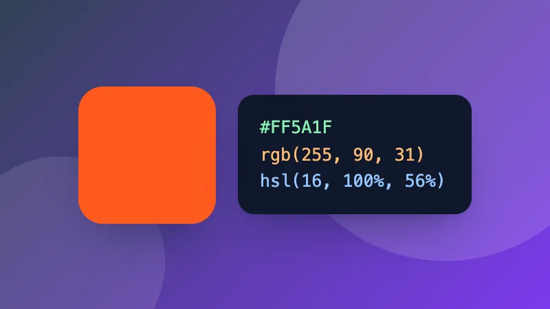
- Bright brand colours like orange, yellow and light green rarely pass on white for body text. Keep them for large headings and buttons, or use a darker shade for text.
- Grey text on white is a common failure: #767676 is the lightest grey that passes AA.
- Don’t use colour alone to show meaning (like red for errors); add an icon or words too.
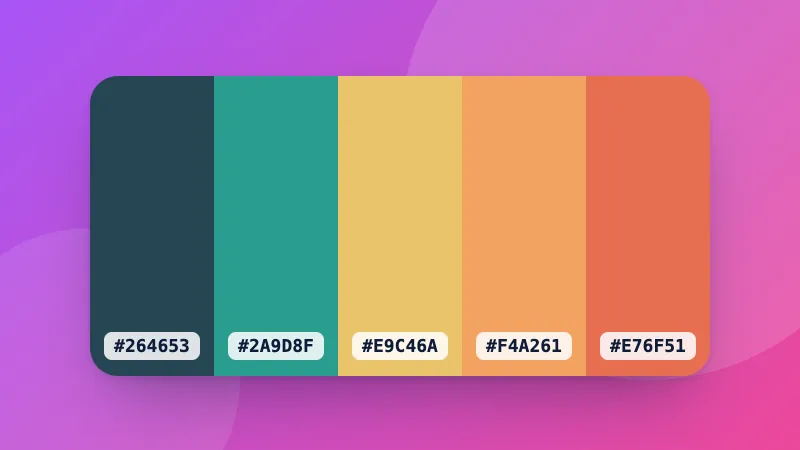
Building a palette? Try the colour palette generator and the colour converter.