WCAG contrast levels
Tips for accessible colours
- Bright brand colours like orange, yellow and light green rarely pass on white for body text. Keep them for large headings and buttons, or use a darker shade for text.
- Grey text on white is a common failure: #767676 is the lightest grey that passes AA.
- Don’t use colour alone to show meaning (like red for errors); add an icon or words too.
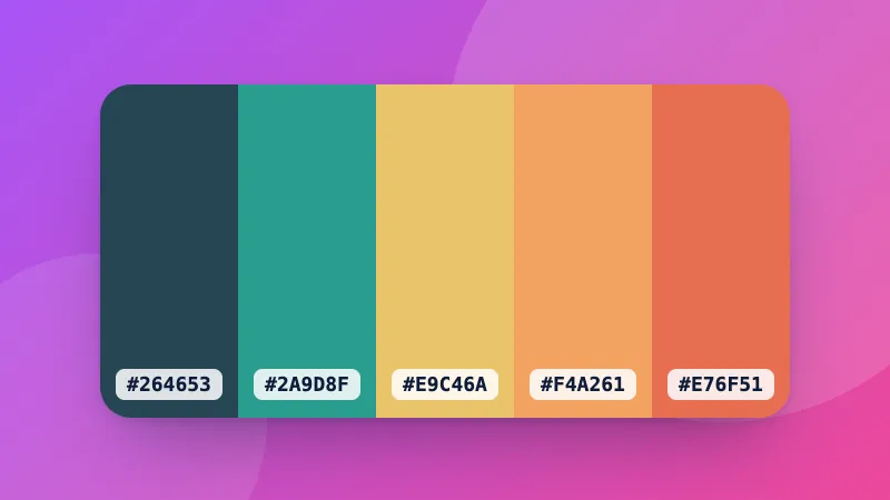
Building a palette? Try the colour palette generator and the colour converter.
Frequently asked questions
What contrast ratio do I need?
WCAG level AA, the usual legal and design standard, needs 4.5:1 for normal text and 3:1 for large text (24px, or 18.5px bold) and for icons, borders and other interface parts. Level AAA, the stricter one, needs 7:1 for normal text and 4.5:1 for large text.
How is the contrast ratio calculated?
From the relative luminance (perceived brightness) of the two colours: (lighter + 0.05) ÷ (darker + 0.05). It runs from 1:1 (the same colour) to 21:1 (black on white).
What does “Suggest a passing colour” do?
It keeps the hue of your text colour and makes it darker or lighter, just enough to reach AA (4.5:1) on your background, so you can stay close to your brand colour.
Which colour formats can I type?
Hex (#F60, #FF6600), rgb(255, 102, 0), hsl(24, 100%, 50%), or a CSS colour name like navy. Or use the colour picker.