The px to rem formula
rem = px ÷ root font size
px = rem × root font size
Example
With the usual 16px root size, a 24px heading is 24 ÷ 16 = 1.5rem, and 12px of padding is 0.75rem.
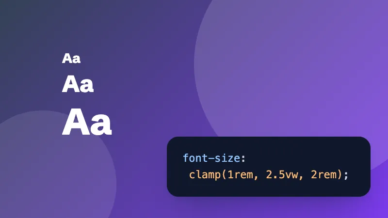
Building fluid type? The CSS clamp calculator makes a font size that grows smoothly between two screen widths.
Frequently asked questions
How do I convert px to rem?
Divide the pixels by the root font size, which is 16px in every browser unless you change it. 24px ÷ 16 = 1.5rem. To go back, multiply: 1.5rem × 16 = 24px.
Why use rem instead of px?
rem sizes follow the visitor's browser font setting. Someone who sets a larger default text size for easier reading gets bigger text and spacing everywhere, while px sizes stay fixed.
What's the difference between rem and em?
rem is relative to the root (html) font size, so it's the same everywhere on the page. em is relative to the font size of the element itself (or its parent), so it compounds when elements are nested.
What if my site sets html { font-size: 62.5% }?
That makes 1rem equal 10px, so the maths is easy (24px = 2.4rem). Set the root font size to 10 here to match.