How to make a chart
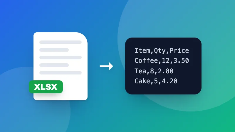
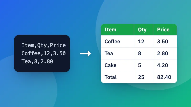
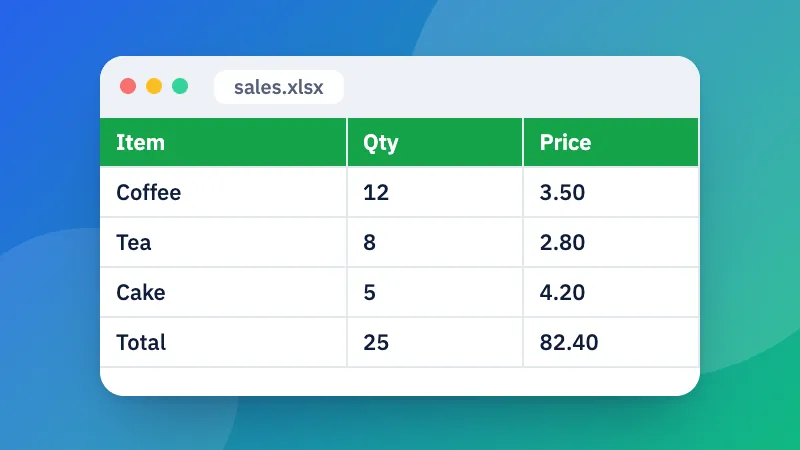
- Type or paste your data: a label and one or more numbers on each line. Add a first line with names to get a legend.
- Pick a chart type, colours and size. The chart updates as you type.
- Download it as a PNG for documents and social posts, or as an SVG for print and design apps.
Which chart should I use?
- Column or bar to compare amounts between categories. Use bar when labels are long.
- Line or area to show a change over time.
- Stacked column to show totals and what they’re made of.
- Pie or donut to show parts of a whole, with no more than about six slices.
Want the chart in a poster or slide? Add one in the presentation maker or poster maker.